top of page

Unit Projects

01
Unit 1: Stamp Project
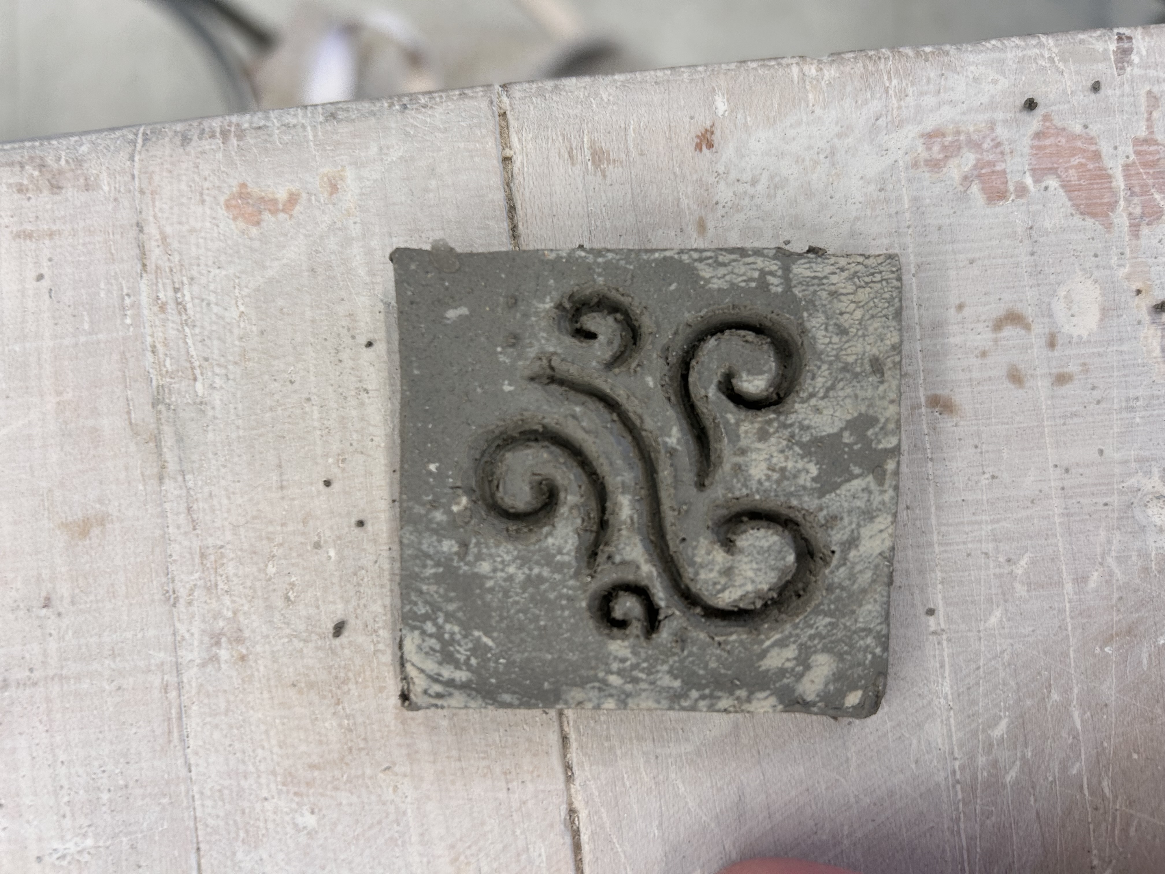
Planning: I wanted to create a design with some sort of swirl or spiral. I love the way it looks bunched up with different sizes. Visually, I wanted it to flow nicely.
reflection:I love the way it turned out but if I was going to do it again I would make the indents larger. Some of them are kinda small but it still works as a stamp.
reflection:I love the way it turned out but if I was going to do it again I would make the indents larger. Some of them are kinda small but it still works as a stamp.

02
Unit 1: Face Project
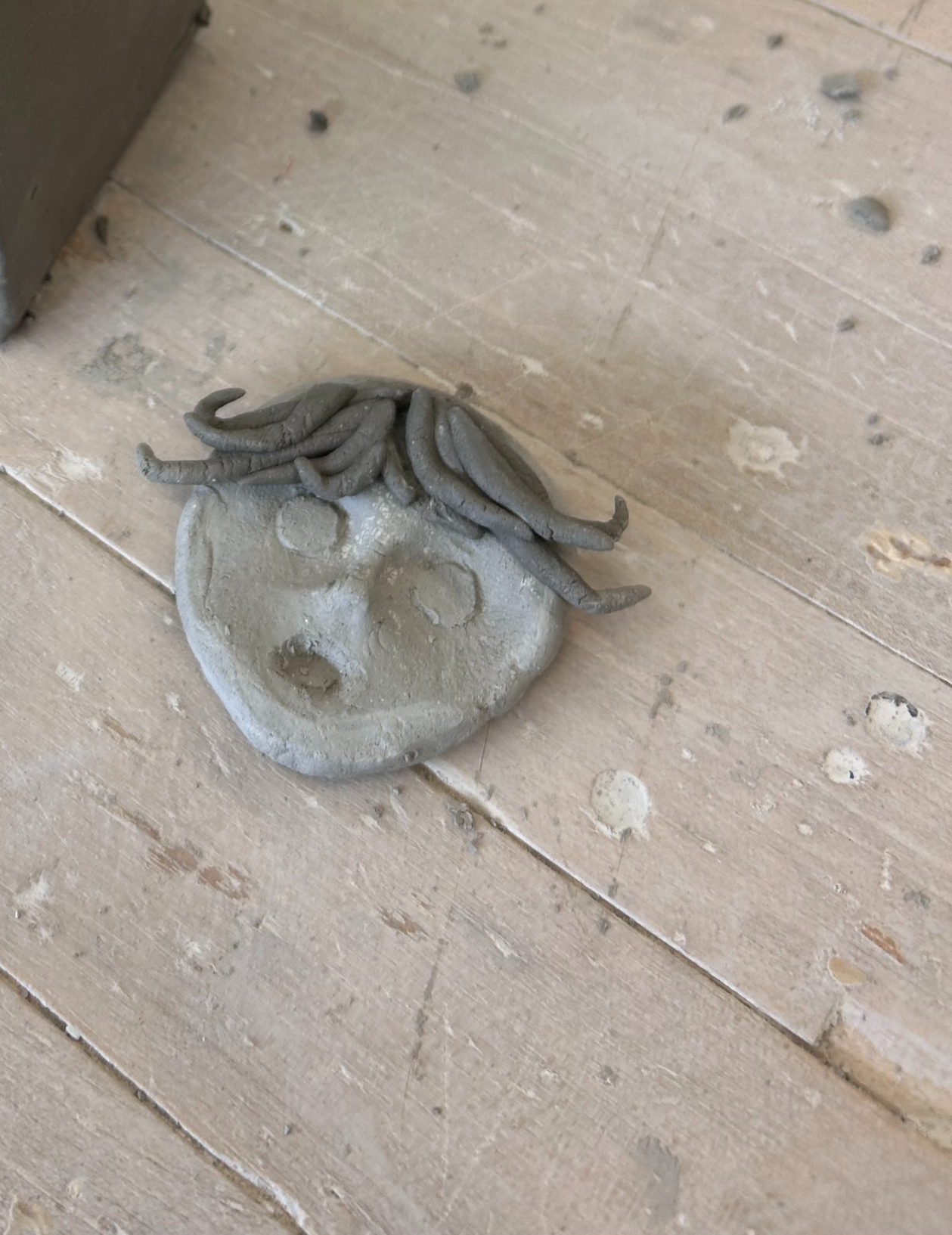
Planning: The emotion I wanted to represent was fear. I wanted to make a face with huge eyes because usually, the larger the eyes, the more fearful the person. I wanted all the other facial features to be small, so the focus is on the eyes. And I wanted the hair to look a little wind-blown, like she was outside on a stormy night.
Reflection: I should have added more details to the eyes and face. I didn't want to take on too much for my first project, but if I did it again, I would definitely spend less time on the hair and more time on the face. I decided not to paint it, though, because I liked the way it looked naturally. It made the face look more desturbed.
Reflection: I should have added more details to the eyes and face. I didn't want to take on too much for my first project, but if I did it again, I would definitely spend less time on the hair and more time on the face. I decided not to paint it, though, because I liked the way it looked naturally. It made the face look more desturbed.

03
Unit 1: Choice Project
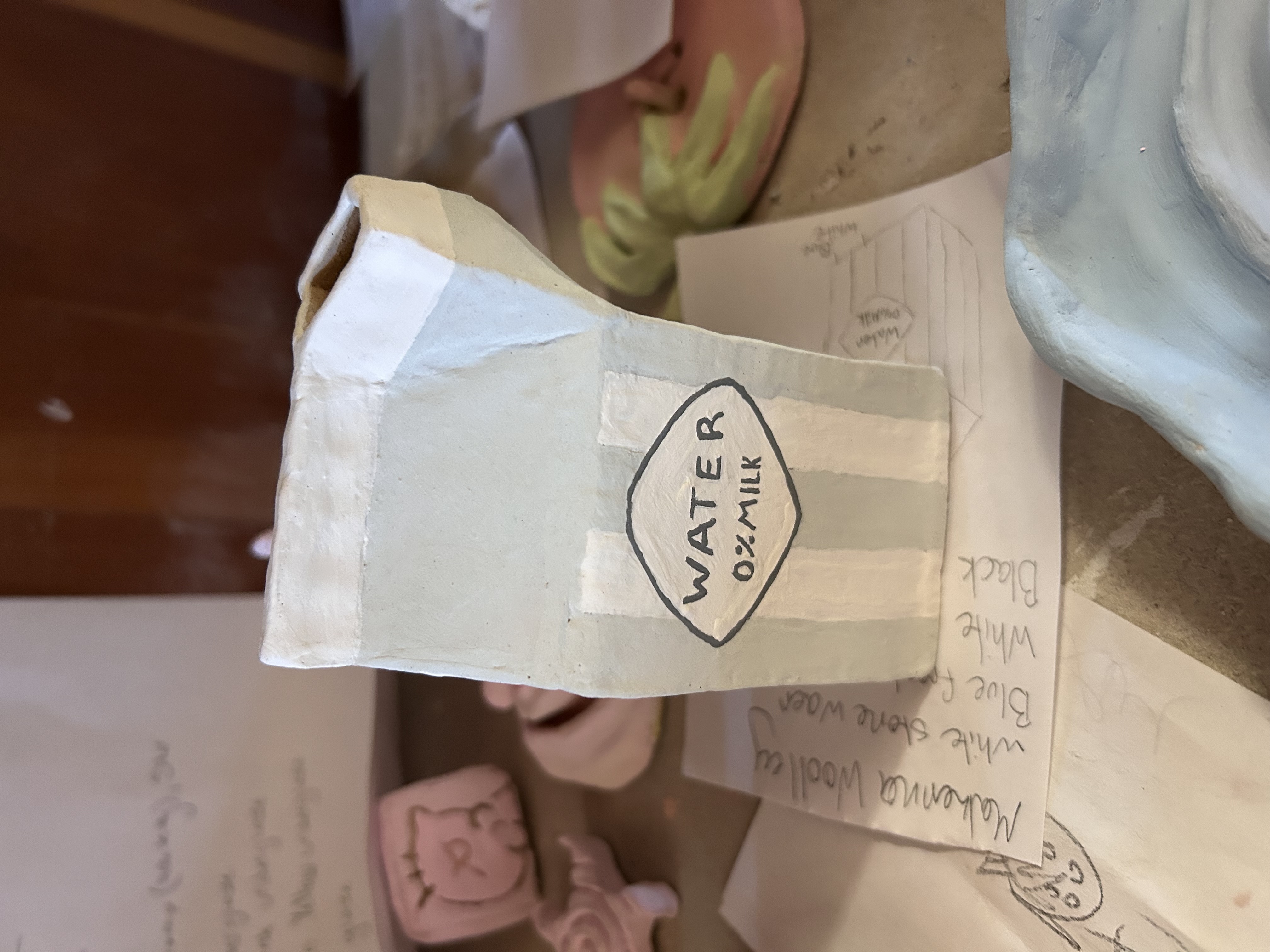
Planning: I wanted to make a milk carton to drink from or put flowers in. I wanted the shape to match an actual milk carton as closely as possible. I want the label to say water; it's kind of an ironic joke.
Reflection: I took my time cutting out the shapes. I spent most of it just smoothing the sides so they were as close as they could possibly look to a milk carton. If I were to do it again, I would apply more layers of glaze. Because when it fired, it was kinda patchy. But I wouldn't change the color or the layout. Overall, I'm really proud of how it turned out.
Reflection: I took my time cutting out the shapes. I spent most of it just smoothing the sides so they were as close as they could possibly look to a milk carton. If I were to do it again, I would apply more layers of glaze. Because when it fired, it was kinda patchy. But I wouldn't change the color or the layout. Overall, I'm really proud of how it turned out.
Unit 1:
Unit 2:

01
Unit 2: Historically inspired piece
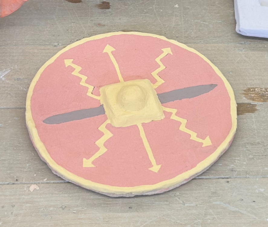
Planning: I wanted to make a weapon of historical structure. I didn't want to just make historically inspired ceramics. I wanted to think outside the box a little. I decided on a shield, and I took inspiration from Roman shields because of their bright color and interesting design.
Reflection: I love the bright red I chose; it's very attention-grabbing. But if I were to do it again, I would most likely make a rectangular shield instead. I don't like the circle shape very much, but I love the painted designs. And I really like the yellowish-gold color.
Reflection: I love the bright red I chose; it's very attention-grabbing. But if I were to do it again, I would most likely make a rectangular shield instead. I don't like the circle shape very much, but I love the painted designs. And I really like the yellowish-gold color.

02
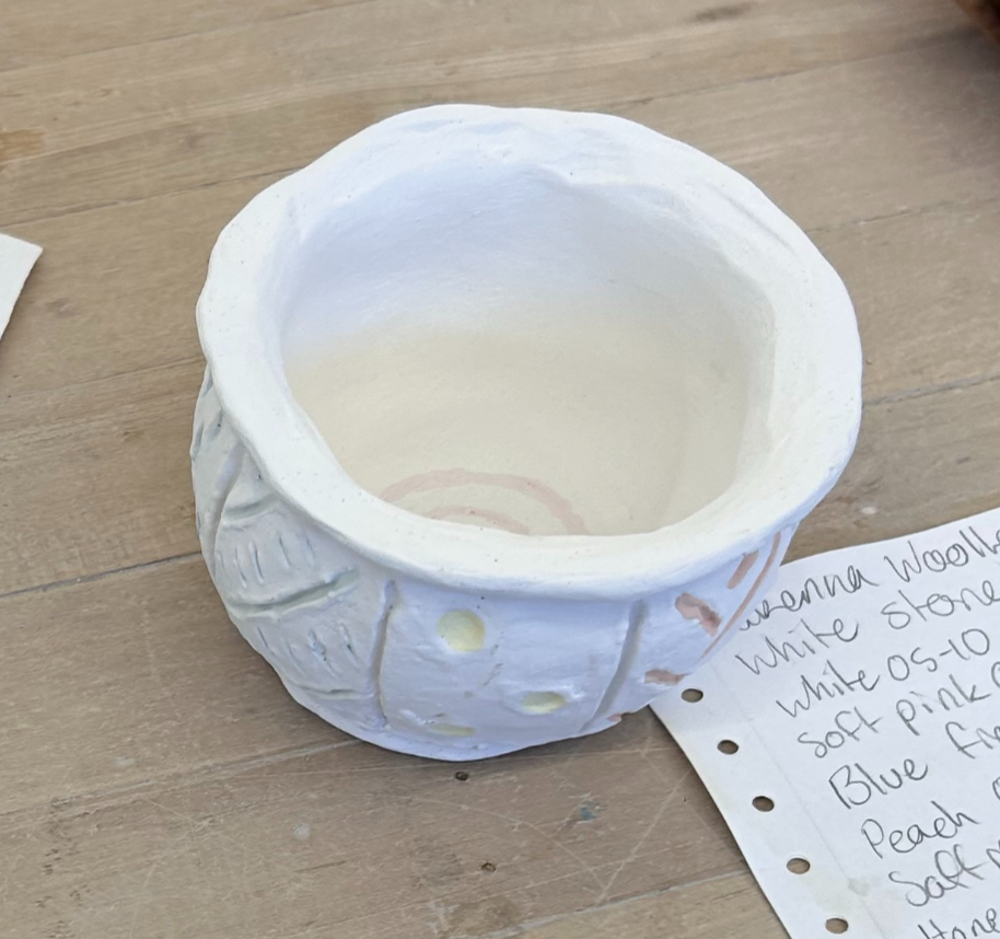
Untit 2: Pinch pot
Planning: I knew that my first pinch pot was going to be kind of messy, so I went with a design that fit with the messiness. I wanted to make little sections on the pot where I could just make little doodles. Like I was drawing on a piece of paper. And I wanted the drawings to be all different colors.
Reflection: I love the look of the white pot with the colorful doodles. And I like that I decided to use pastels to make the doodles: it gives it a softer look to it. The pot isn't perfect ans the rim is very lopsided but that just adds to the design. Its meant to not be perfect.
Reflection: I love the look of the white pot with the colorful doodles. And I like that I decided to use pastels to make the doodles: it gives it a softer look to it. The pot isn't perfect ans the rim is very lopsided but that just adds to the design. Its meant to not be perfect.

03
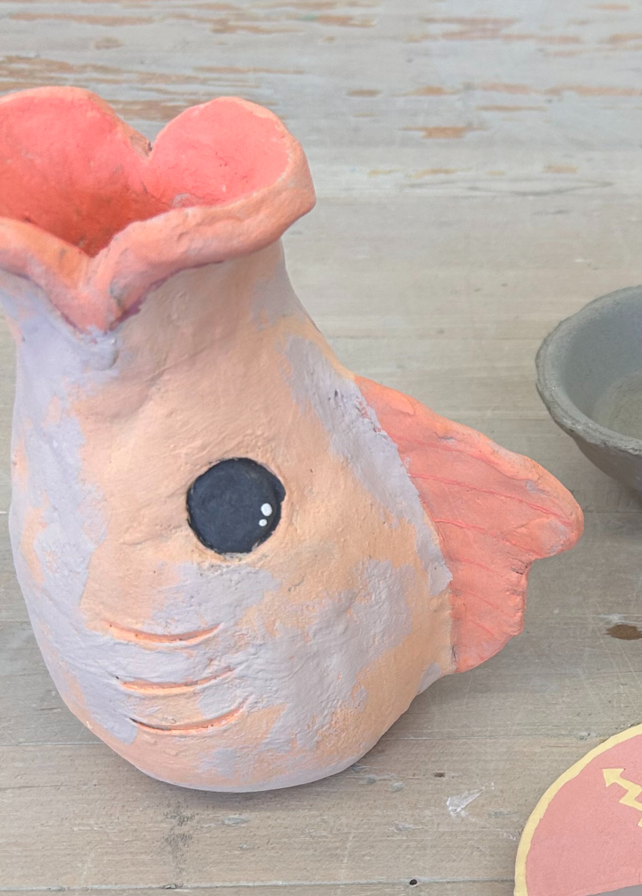
Unit 2: double pinch pot
Planning: I wanted to take inspiration from a goldfish piggy bank. My version is a fish vase for flowers. The opening is the fish's mouth, and the orange color is similar to that of a goldfish.
Reflection: I love the eyes and the way they look compared to the rest of the fish. I wish I had been more detailed with the painting of the rest of the fish. The lips, especially, look very messy. If I were to do it again, I would be more patient with the gazing, and I would not rush the project.
Reflection: I love the eyes and the way they look compared to the rest of the fish. I wish I had been more detailed with the painting of the rest of the fish. The lips, especially, look very messy. If I were to do it again, I would be more patient with the gazing, and I would not rush the project.

04
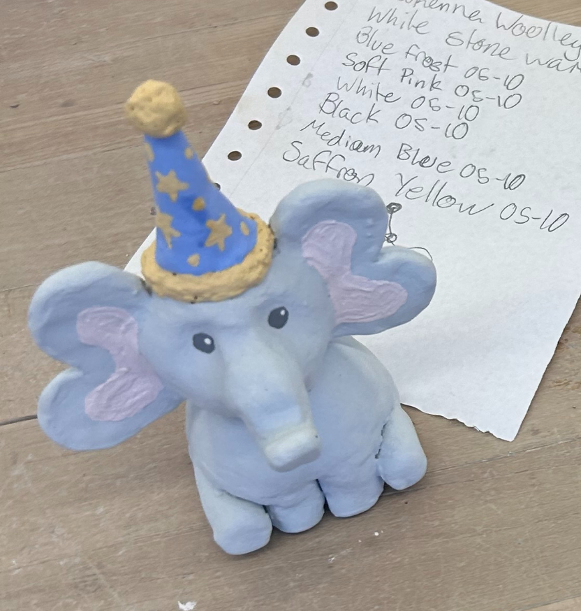
Unit 2: Small animal sculpture.
Planning: For Secret Santa last year, my friend gifted me a little elephant made out of air-dry clay. It was to hold my glasses when I sleep. Sadly, it broke when she brought it to school. So when we got our animal project, I decided to remake it as close to the original as possible.
Reflection: I love the way it turned out. The colors are identical to the original. The only thing that's different is I made the ears curved instead of just round like the original elephant. But I like that I put my own little spin on it. It still serves its purpose of holding my glasses, and I don't think I would do anything differently if I did it again.
Reflection: I love the way it turned out. The colors are identical to the original. The only thing that's different is I made the ears curved instead of just round like the original elephant. But I like that I put my own little spin on it. It still serves its purpose of holding my glasses, and I don't think I would do anything differently if I did it again.

05
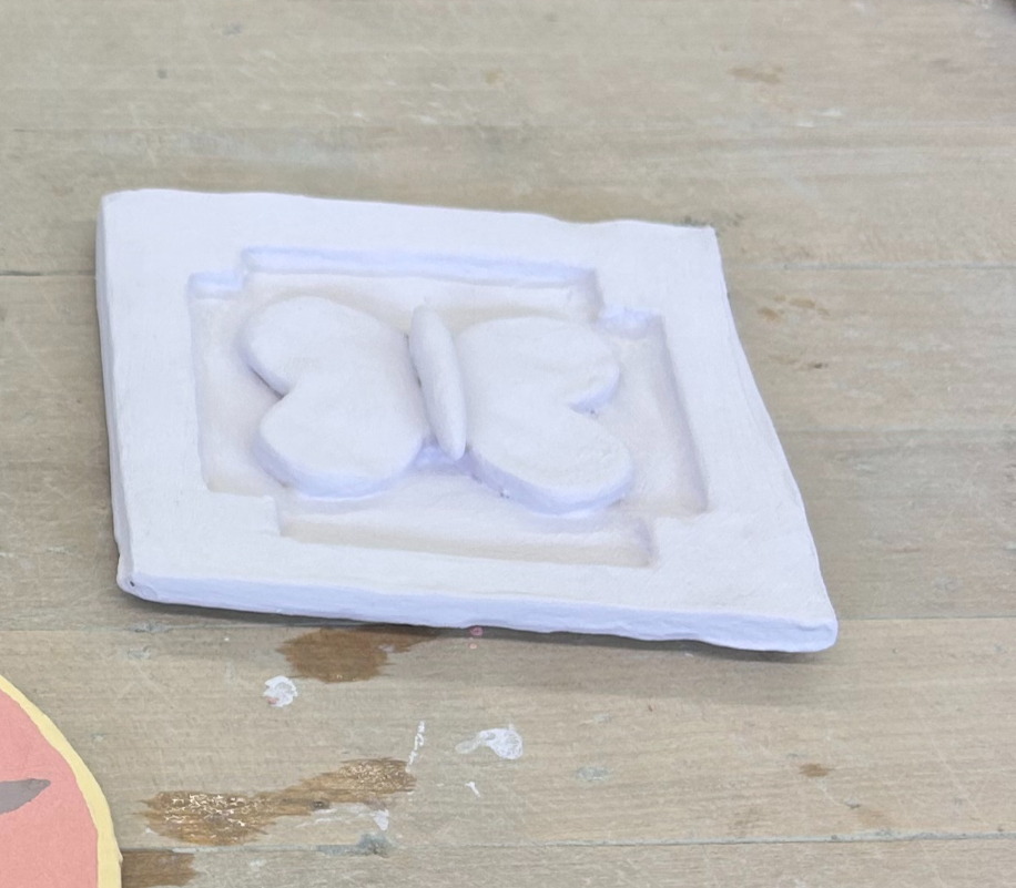
Unit 2: relief sculpture
Planning: I wanted to make a jewelry dish for my mom so she could have somewhere pretty to put her jewelry on her nightstand. I wanted to paint it a light purple color with a butterfly in the center.
Reflection: I love the color and the way the background design came out. But if I were to do it again, I would make the butterfly smaller. You can't fit that much jewelry in it, so that's a pretty big design flaw. Overall, I think I did a good job for my first attempt at making a jewelry dish.
Reflection: I love the color and the way the background design came out. But if I were to do it again, I would make the butterfly smaller. You can't fit that much jewelry in it, so that's a pretty big design flaw. Overall, I think I did a good job for my first attempt at making a jewelry dish.

06
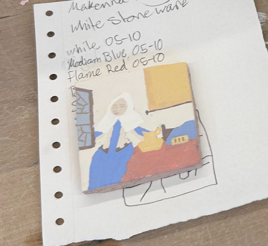
Unit 2: Mini masterpiece
Planning: I wanted to do a painting that didn't have too many tiny details, because I'm not very skilled at painting. I decided on this Vermeer because it seemed rather simple
Reflection: If I were to do this again, I would choose a painting with no people, or at least no faces. The small details like her eyes and mouth were very hard to do and made the whole painting look bad. I think I did well on the background and window, but the woman doesn't look very good.
Reflection: If I were to do this again, I would choose a painting with no people, or at least no faces. The small details like her eyes and mouth were very hard to do and made the whole painting look bad. I think I did well on the background and window, but the woman doesn't look very good.
Heading 4
01
Unit 1: Stamp Project
Planning: I wanted to create a design with some sort of swirl or spiral. I love the way it looks bunched up with different sizes. Visually, I wanted it to flow nicely.
reflection:I love the way it turned out but if I was going to do it again I would make the indents larger. Some of them are kinda small but it still works as a stamp.
reflection:I love the way it turned out but if I was going to do it again I would make the indents larger. Some of them are kinda small but it still works as a stamp.
02
Unit 1: Face Project
Planning: The emotion I wanted to represent was fear. I wanted to make a face with huge eyes because usually, the larger the eyes, the more fearful the person. I wanted all the other facial features to be small, so the focus is on the eyes. And I wanted the hair to look a little wind-blown, like she was outside on a stormy night.
Reflection: I should have added more details to the eyes and face. I didn't want to take on too much for my first project, but if I did it again, I would definitely spend less time on the hair and more time on the face. I decided not to paint it, though, because I liked the way it looked naturally. It made the face look more desturbed.
Reflection: I should have added more details to the eyes and face. I didn't want to take on too much for my first project, but if I did it again, I would definitely spend less time on the hair and more time on the face. I decided not to paint it, though, because I liked the way it looked naturally. It made the face look more desturbed.
03
Unit 1: Choice Project
Planning: I wanted to make a milk carton to drink from or put flowers in. I wanted the shape to match an actual milk carton as closely as possible. I want the label to say water; it's kind of an ironic joke.
Reflection: I took my time cutting out the shapes. I spent most of it just smoothing the sides so they were as close as they could possibly look to a milk carton. If I were to do it again, I would apply more layers of glaze. Because when it fired, it was kinda patchy. But I wouldn't change the color or the layout. Overall, I'm really proud of how it turned out.
Reflection: I took my time cutting out the shapes. I spent most of it just smoothing the sides so they were as close as they could possibly look to a milk carton. If I were to do it again, I would apply more layers of glaze. Because when it fired, it was kinda patchy. But I wouldn't change the color or the layout. Overall, I'm really proud of how it turned out.
bottom of page